DailySEOblog|Increase your website traffic and online income with Search Engine Optimization
Boost your online income with SEO!
Thinking of outsourcing your SEO work?
Get higher ranks on Google, Yahoo and MSN with professional Search Engine Optimization. Learn the science of SEO yourself with jargon free SEO tips. You'll find SEO tips for CMS, Wordpress, Joomla, Forums, Blogger and other platforms. Or, if you'd like professional consultation, hire the best SEO in India.
Get higher ranks on Google, Yahoo and MSN with professional Search Engine Optimization. Learn the science of SEO yourself with jargon free SEO tips. You'll find SEO tips for CMS, Wordpress, Joomla, Forums, Blogger and other platforms. Or, if you'd like professional consultation, hire the best SEO in India.
Jan
07
Filed Under (Uncategorized) by Mani Karthik on 07-01-2007
Haven’t you seen those scraps in Orkut where somebody has used wild characters to make their
 own image? At first glance, any novice would think that it is manually typed. But it isn’t (You knew it already - you techie!).
This is done by a simple program like the ASCII Generator. This program converts an image into corresponding ASCII codes/characters.The characters are selected and replaced in the image, based on the images contrast and sharpness.Dark areas will be placed by a particular character whereas, light areas will be left blank and mid-tones will be placed appropriately by a similar shaded character.
This is how it works
- Just select the photo you need to convert to characters.
- On the next tab you automatically get the ASCCI character code generated for the image.
- Copy the character code(Right click> Select All)
- Paste it where you want.
- You can also save the character image as a gif.
There are five sets of ASCII character code so that you can select which ever you need.
You may also tweak the images brightness and contrast so that the resulting character image appears the way you like it.
There is an option for batch conversion - where in you can select a directory and all the images in the directory will be converted to the ASCII character image.
This is a freeware and you can get a copy of the tool here
If you enjoyed this post, make sure you subscribe to my RSS feed!
Jan
07
Filed Under (Uncategorized) by Mani Karthik on 07-01-2007

The other day, i was doing a research on what MFA’s are - Made for AdSense sites - yes !
What prompted me to do this - a thread on DP which had some member shout - “Ah! that’s a stupid MFA - i don’t see any stuff on it - just another link junk” The guy was talking about about.com - one of the top ranked sites on Google for many keywords.
Why is about.com an MFA ?
- It has very little information(on each page), thousands of pages, lots of crappy ads on each page and has low satisfaction levels on end user experience.
Many of us would agree that it has lot of pages, but all of them with very little information - injected in many a times - just for the sake of it - and importance is given to placing ads rather than information and a user is satisfied rarely with the information given.
The basic idea about “About” is that - to inject in more pages - with 25% information - 50% advertisement and another 25% links.
The information given on the website is always Primary in nature - that is, it either gives you a suggestion or prompts you to use the links - you cannot find an information at one stop on any of the pages. Well, link are always welcome but lots of them just for the sake of it? Not cool.
I searched for “Free mp3″ on about and landed up on this page.(see screenshot)
Apart from the topic links on the left hand panel and the crowded ads - there is the heavily camouflaged - Offers - just beneath them(Orange on screenshot) - these are not mostly irrelevant topics at all but sponsored ads - Here’s what about has to say about them.
What are offers?These offers are linked to ads purchased by companies that want to advertise next to relevant content, based on a set of keywords they specify. The offers are administered, sorted and maintained by a third party
If you take a look at the screenshot, you’ll see that the area marked green(25%) is the only section with content(Primary that is). Rest of the red coloured area(50%) is advertisements.The yellow coloured region is actually a repeat ad - where all the links are the same and is just repeated! This together with the white area where majority of the links are placed from the rest 25%.
There is a thin(but prominent) line between a well designed/placed page and a spam MFA. When more and more web masters are concerned only about the monetization part and CTR of their site, a serious damage occurs to the total quality of the site. It is high time Google made their police team. If you have an MFA spotted, please report to - Vinabet.net
If you enjoyed this post, make sure you subscribe to my RSS feed!
Jan
06
Filed Under (Uncategorized) by Mani Karthik on 06-01-2007
Every day space by Linu is a - well - another blogger who wants to share tips online. This time beauty, websites, life and the like.
On my first glance,i thought it resembled labnol. With the three column layout and the left hand panel very similar to Amit’s blog. Not yet. I scrolled down only to realise that it’s a beautiful (can i say girlish?) blog with some very good tips on lifestyle.
Coming to Adsense placements - Linu thinks that a small banner(234×60) will do the trick. And she has placed one on the very top of the blog and another on the extreme bottom.
There is another 125×125 Button text on the left hand panel as well.
This type of placement is tricky - according to me. When most of us think that only rectangle ads inline with posts will do the magic - Linu is doing an experiment with this.
If you ask me, i think it should work - even though not quite effectively.
The first reason why i think it should work is that - it is different from the normal (Inline rectangle) placements. (Even though they are the best.)
The small banners on the top and bottom cannot do much but the button text on the left hand panel should do the trick. It sits there, smoothly blended waiting for someone to click on.
Here are the reports and my suggestions to Linu.
Background colour - Yes, Matches
Font colur - Yes, Matches
Font size - Yes, Matches
Title colour - Yes, Matches
Link colour - Yes, Matches
Text colour - Yes, Matches
Background/boxed - Yes
Placement - Above fold button text, one above and one below fold banner.
Number of ads - Three plus one Ad unit.
AdLink unit - Yes
Placement - Above fold
Background image - Blended
Category Match - Perfect
Special mention should goto the colour matching done with the ads and the background. Linu has carefully matched the font type, font colour, title color and background perfectly with the blog theme. A perfect camouflage.
Meanwhile, Linu have made a blunder - The two banners on the top and bottom does not show the site url it is masked in the box background colour - this is against Google TOS. I hope this is corrected immediately!
Also, the ad link units are placed well above the fold and on the hotspot area.
My suggestion to Linu is that - Take away both the 125×125 banners(top and bottom) and instead, place rectangles(300×250) inline with post.
Also, a skyscraper can replace the button text on the left hand panel - but if it is working well at the moment, then it can be avoided. Also, the sitemeter button that does not blend at all with the theme could be removed from the above fold and brought somewhere below the fold , as it affects the camouflage of the button text right below it.
All the other factors are favourable for good CTR, but the above change should do some severe hike in the stats. ![]()
If you enjoyed this post, make sure you subscribe to my RSS feed!
Jan
05
Filed Under (Uncategorized) by Mani Karthik on 05-01-2007
It won’t be too far when all blogs will be mobile compatible and people will be using their![]() cell phones to browse the internet. A few rich guys have already managed to get internet ready cellphones for them but the major internet traffic is still on pcs and laptops/firefox and IE’s.
cell phones to browse the internet. A few rich guys have already managed to get internet ready cellphones for them but the major internet traffic is still on pcs and laptops/firefox and IE’s.
In fact, there are a few sites already, that will help you make your mobile presence - yes for free!
Mobisitegalore is a website that gives you
- a free .mobi sub domain,
- a free site builder
- custom template
all with W3org standards.
The process is pretty simple, where they have a simple interface by which you can simply select a custom template(based on your choice of colour), edit the titles/ and pages, add images etc.
There are different pages available, and they can be re arraged or edited according to yor preference.Completely editable.
All you need is some content, an idea of layout(what comes first) and a good domain name.
You get a free domain name like http://yourname.websiteforever.com (Yes that’s for ever free!)
This service runs on donations and i strongly recommend you to donate to them because they deserve it.I think this service is pretty cool that a user does not require any XHTML knowledge to build the site.I can only think of this concept as cool was geocities during the 90’s, when they offered websites for all.
I suggest that you create a webpage on mobi, then use these tools to check their compatibility so that your’e sure about the site.
- Mobi ready report - Tells you if the site is compliant to w3G standards.
- Device Independant Authoring Lanugage - A W3G guide on mobile content standardization.
- Nokia WAP gateway simulator 4.0 - A Nokia tool by which you can simply simulate how your mobi webpage will look on cell phones.
Goto mobisitegalore > register yourself(free) and create your mobile presence today.
Here is mine - http://dailydose.websiteforever.com
If you enjoyed this post, make sure you subscribe to my RSS feed!
Jan
04
Filed Under (Uncategorized) by Mani Karthik on 04-01-2007
Have you ever imagined - What if Crazy frog sung chart busters like “Thriller” and “Paint my love”? Intersting isn’t it?
Here’s a quick tutorial that will help you make Crazy Frog sing all your favourite songs!
All you need is a sound editing program like Sony Sound Forge or Nero Wav Editor(Included in your Nero 6>bundle).
I’ll pick the very famous “Himesh Reshammiya” with his popular song - Jhalak Dikhlaja - I’m gonna make our very own “Annoying thing” sing the song for us.(After all, we’re all bored hearing the same man mooooowwwing it to us.)
Here we go!
Step 1
Open the wav editor - Sony Sound Forge.
Open the file you want crazy frog to sing. (In the demo version of sound forge, mp3 version isn’t supported so you may have to convert your mp3 file to wav using Nero Wav editor or Zamzar) Step 2
Hit CTRL + A(Select All) - Now the entire area will be highlighted.
Step 3
Goto Menu Effects> Pitch>Shift (see screencap) Step 4
In the Pitch shift properties menu that appears, enter the following.
Select Fifth Up from the presets. Tick select - “Apply anti alias filter” and “Preserve duration” - so that the song is not distorted.
 Move the slider bar - “Semitones to shift pitch by” to a higher value like 8(play around with it to suit your requirement - I recommend 8 or 9)
 Make sure the final setting looks similar to the below screenshot.
 Step 5
Click OK and play the file by hitting the space key.
Save the file.
Here is what i made out of Jhalak Dikhlaja - You can use this as your ringtone.
Transfer the file to your ipod/mobile and play it loud to your friends.
If you enjoyed this post, make sure you subscribe to my RSS feed!
Jan
03
Filed Under (Uncategorized) by Mani Karthik on 03-01-2007
Webshots are screenshots of websites. You could simply use the age old- “Print screen” technique to take a screenshot of any website, but if you are looking for more options like, shots at various resolution and sizes here are a few tools that might help.
Here is a pretty cool online application,Webshotspro ,that will make you free screenshots of any website.(Free? Yes) This is similar to Nathan’s webshot tool that helps you take screenshot of any website, irrespective of the resoultion - full size.![]()
I used Nathan’s webshot tool always whenever i needed a webshot - it was simply cool and easy! But with Webshotspro coming in, i may avoid it just because it will help me save more time.
The difference with this one(Webshotspro) is that you don’t download anything, just give the url, and it take the screencapture just like a snap - Online.
Here is a comparison on both tools in case you are confused.
Nathan’s Webshot Software
- Download the tiny software(518 Kb)
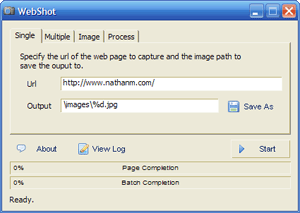
- Screenshots of full webpage Screenshots to window size (irrespective of screen resolution)
- Lots of options available (image Quality, File size, Resolution, Commands etc)
- In order to post to a blog Upload to an image hosting tool required.
- Free
- Less Quick
Webshots Online tool
- No Downloads at all - Online tool
- Screenshots to window size
- No options available
- Same here
- Free
- Very Quick
If you are looking for a firefox extension to take screenshots of websites - try Screen Grabber by Andy Mutton. It’s a simple addon that let’s you take screenshots of websites that your’e visiting by just right clicking on it. It’s a messy one around though, because - it requires a Java platform and is not compatible with the latest version of Firefox.
If you enjoyed this post, make sure you subscribe to my RSS feed!
-
Subscribe and Connect


-
Sponsors


DailySEOblog.com copyrights reserved 2007-08 | Want help on optimizing your site ? Hire an affordableSEO