Get higher ranks on Google, Yahoo and MSN with professional Search Engine Optimization. Learn the science of SEO yourself with jargon free SEO tips. You'll find SEO tips for CMS, Wordpress, Joomla, Forums, Blogger and other platforms. Or, if you'd like professional consultation, hire the best SEO in India.
Every day space by Linu is a - well - another blogger who wants to share tips online. This time beauty, websites, life and the like.
On my first glance,i thought it resembled labnol. With the three column layout and the left hand panel very similar to Amit’s blog. Not yet. I scrolled down only to realise that it’s a beautiful (can i say girlish?) blog with some very good tips on lifestyle.
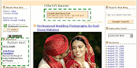
Coming to Adsense placements - Linu thinks that a small banner(234×60) will do the trick. And she has placed one on the very top of the blog and another on the extreme bottom.
There is another 125×125 Button text on the left hand panel as well.
This type of placement is tricky - according to me. When most of us think that only rectangle ads inline with posts will do the magic - Linu is doing an experiment with this.
If you ask me, i think it should work - even though not quite effectively.
The first reason why i think it should work is that - it is different from the normal (Inline rectangle) placements. (Even though they are the best.)
The small banners on the top and bottom cannot do much but the button text on the left hand panel should do the trick. It sits there, smoothly blended waiting for someone to click on.
Here are the reports and my suggestions to Linu.
Background colour - Yes, Matches
Font colur - Yes, Matches
Font size - Yes, Matches
Title colour - Yes, Matches
Link colour - Yes, Matches
Text colour - Yes, Matches
Background/boxed - Yes
Placement - Above fold button text, one above and one below fold banner.
Number of ads - Three plus one Ad unit.
AdLink unit - Yes
Placement - Above fold
Background image - Blended
Category Match - Perfect
Special mention should goto the colour matching done with the ads and the background. Linu has carefully matched the font type, font colour, title color and background perfectly with the blog theme. A perfect camouflage.
Meanwhile, Linu have made a blunder - The two banners on the top and bottom does not show the site url it is masked in the box background colour - this is against Google TOS. I hope this is corrected immediately!
Also, the ad link units are placed well above the fold and on the hotspot area.
My suggestion to Linu is that - Take away both the 125×125 banners(top and bottom) and instead, place rectangles(300×250) inline with post.
Also, a skyscraper can replace the button text on the left hand panel - but if it is working well at the moment, then it can be avoided. Also, the sitemeter button that does not blend at all with the theme could be removed from the above fold and brought somewhere below the fold , as it affects the camouflage of the button text right below it.
All the other factors are favourable for good CTR, but the above change should do some severe hike in the stats. ![]()
If you enjoyed this post, make sure you subscribe to my RSS feed!


