Get higher ranks on Google, Yahoo and MSN with professional Search Engine Optimization. Learn the science of SEO yourself with jargon free SEO tips. You'll find SEO tips for CMS, Wordpress, Joomla, Forums, Blogger and other platforms. Or, if you'd like professional consultation, hire the best SEO in India.
Every week, I’ll be picking up a blog from one of the top commenters, and I’ll be reviewing the blog/website in an SEO perspective, dissecting it by the basic elements of SEO. The idea is to give readers an opportunity to learn the basic SEO by observing another blog, which should in turn help them improve theirs.
This weeks pick is Stephan Millers blog which deals with blogging, seo, wordpress and earning money online.
Site: www.stephanmiller.com
Page Rank: 3
Alexa: 169,139
Meta Keywords: Quite a lot.
Meta Description: None found.
Links spiderable: Yes
Google snippet data : “Popular Posts. Feedburner Feedsmith Plugin Security Issue · Moving Day · Google Adwords Industry Related Help · Google Just Gave Me the John Chow Treatment …”
Incoming links on Google: 69
No. of pages indexed on Google:206
What is good in the blog?
- Each article stands out with titles using bold and large font
- Well arranges sidebars with categories, top commentators etc
- What is exceptionally good is the popular posts highlighted on the top right corner
- Text is very well spaced and in good size, good accessibility
- Feed subscription options right on top, very easy to spot
- Stephan’s photo gives an identity
What’s not looking good?
- Somehow, I don’t feel like the theme is compact.
- Colors are missing.
- Stephan’s photo
- The footer seems to be out of shape with widgets aligned improperly
What can be done?
- In the footer, probably he should take out one of those widgets and cut it down to one “recent visitors” widget.
- Align the blogrush widget with the recent visitors widget
- Stephan should replace his photo with a much better one, the current one looks jagged
- Add a search button to the search bar
- Add meta description for the blog
- Stephan should work on link building, as the number of incoming links is not impressive at the moment.
- Reduce the number of keywords used in the meta keywords tag and keep only the most relevant ones only - it looks spammy now.
- The feedburner feed count is fairly low, so it can be removed until it reaches a “boastable” number.
- The title of the homepage is just his name. I think he should add a tag line to this like, “Make money online with Stephan Miller”. Of course, it’s up to Stephan to decide based upon what the objective of the blog is. Title tags for the articles seems cool, I think Stephan is using the AllinOone SEO pack for this.
So, those were some quick notes on the site. I’ve talked only about the basic stuff here. Hope it gave you some pointers as to what are the factors that count most.
I’d love to hear from you suggestions, opinions and corrections on the review.
If you enjoyed this post, make sure you subscribe to my RSS feed!

There are a lot of blogging talents around, that we often over look just because we are so used to think about our own blog only. Nirmal TV is an active blogger in the blogosphere here in India. His blog Life Rocks 2.0 features articles on technology, tips and tricks, blogging, tutorials and the internet ! I’ve been very impressed with his socializing skills in the Indian Arena of blogs. His blog receives on an average 20 comments on every article. Pretty cool that is!
I’m still unsure how he’s able to make others comment on his articles. However one thing that I noticed is that Nirmal himself makes it a point on other blogs too. And most of the commenters on his blog are reciprocal commenters. Which is not bad at all.
When a first time visitor comes to his blog, they’ll see a lot of comments and gets a good impression about him. And he’s likely to grab his feed. This is a great lesson to learn from Nirmal.
Nirmal is up-to-date on technology within his reach, and often strikes a point blogging about it prior to anybody else. Clever! Something to be noted about Nirmal’s articles is that he churns out lot of “Numbered lists”. Like Top 10 themes, Top 10 plugins and the like which gets dugged and stumbled upon by his readers which in turn gives him lot of traffic. Interestingly, Nirmal prefers lists with odd numbers like 7 and 9 rather than 5 and 10, which are very common on the internet.
Apart from all these stunts, Nirmal is out to grab more organic traffic online by harnessing the power of SEO. He’s approached me for a quote too. Too clever! ![]()
If you enjoyed this post, make sure you subscribe to my RSS feed!
Amit, may wonder why I’m bringing up such silly issues about his blog every time(this is just the second one). Actually, I’m a fan of labnol that i watch it very carefully(more than mine may be), so such things grab my attention.Since he remains busy reading emails, i thought i’ll post it down here.
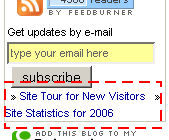
This time, it’s about a simple basic mistake on labnol. If you see the left hand panel, there is a small subscribe box and right above the translator tool, there are two links.
1 - Take a site tour link and 2- Site statistics for 2006.
Interestingly, just like on all the blocks on the right and left hand panels - Amit has used the arrow character as bullet list. But in fact, it isn’t a bullet, it’s only a special character(seen as >>).
The mistake here is that he has forgotten to leave a break space between these two links, that’ll separate them into two lines. As of now, both the links align on the same line, with the bullets!
I would have taken this for a deliberate attempt, had Amit not used the bullets prior to the link.
Whenever there’s a bullet , it’s supposed to be on the next line.
Here’s how the corresponding code looks like -
» <a title=”Are you new here ?” href=”javascript:void(window.open(’http://support.artic…….nY=0′))”>Site Tour for New Visitors</a>
» <a title=”Traffic for 2006″ href=”http://labnol.blogspot.com/2006/12/last-12-months-at-digital-inspiration.html”>Site Statistics for 2006</a>
All Amit need to change is, instead of the two spaces in between the links replace it with a line break(br /) just after this code(before the raquo thing) - Tour for New Visitors</a>
» <a title=”Traffic for 2006
I’m sure Amit will take up this and correct this soon as he did for my earlier discovery on Labnol.
If you enjoyed this post, make sure you subscribe to my RSS feed!

The other day, i was doing a research on what MFA’s are - Made for AdSense sites - yes !
What prompted me to do this - a thread on DP which had some member shout - “Ah! that’s a stupid MFA - i don’t see any stuff on it - just another link junk” The guy was talking about about.com - one of the top ranked sites on Google for many keywords.
Why is about.com an MFA ?
- It has very little information(on each page), thousands of pages, lots of crappy ads on each page and has low satisfaction levels on end user experience.
Many of us would agree that it has lot of pages, but all of them with very little information - injected in many a times - just for the sake of it - and importance is given to placing ads rather than information and a user is satisfied rarely with the information given.
The basic idea about “About” is that - to inject in more pages - with 25% information - 50% advertisement and another 25% links.
The information given on the website is always Primary in nature - that is, it either gives you a suggestion or prompts you to use the links - you cannot find an information at one stop on any of the pages. Well, link are always welcome but lots of them just for the sake of it? Not cool.
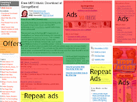
I searched for “Free mp3″ on about and landed up on this page.(see screenshot)
Apart from the topic links on the left hand panel and the crowded ads - there is the heavily camouflaged - Offers - just beneath them(Orange on screenshot) - these are not mostly irrelevant topics at all but sponsored ads - Here’s what about has to say about them.
What are offers?These offers are linked to ads purchased by companies that want to advertise next to relevant content, based on a set of keywords they specify. The offers are administered, sorted and maintained by a third party
If you take a look at the screenshot, you’ll see that the area marked green(25%) is the only section with content(Primary that is). Rest of the red coloured area(50%) is advertisements.The yellow coloured region is actually a repeat ad - where all the links are the same and is just repeated! This together with the white area where majority of the links are placed from the rest 25%.
There is a thin(but prominent) line between a well designed/placed page and a spam MFA. When more and more web masters are concerned only about the monetization part and CTR of their site, a serious damage occurs to the total quality of the site. It is high time Google made their police team. If you have an MFA spotted, please report to - Vinabet.net
If you enjoyed this post, make sure you subscribe to my RSS feed!
Every day space by Linu is a - well - another blogger who wants to share tips online. This time beauty, websites, life and the like.
On my first glance,i thought it resembled labnol. With the three column layout and the left hand panel very similar to Amit’s blog. Not yet. I scrolled down only to realise that it’s a beautiful (can i say girlish?) blog with some very good tips on lifestyle.
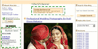
Coming to Adsense placements - Linu thinks that a small banner(234×60) will do the trick. And she has placed one on the very top of the blog and another on the extreme bottom.
There is another 125×125 Button text on the left hand panel as well.
This type of placement is tricky - according to me. When most of us think that only rectangle ads inline with posts will do the magic - Linu is doing an experiment with this.
If you ask me, i think it should work - even though not quite effectively.
The first reason why i think it should work is that - it is different from the normal (Inline rectangle) placements. (Even though they are the best.)
The small banners on the top and bottom cannot do much but the button text on the left hand panel should do the trick. It sits there, smoothly blended waiting for someone to click on.
Here are the reports and my suggestions to Linu.
Background colour - Yes, Matches
Font colur - Yes, Matches
Font size - Yes, Matches
Title colour - Yes, Matches
Link colour - Yes, Matches
Text colour - Yes, Matches
Background/boxed - Yes
Placement - Above fold button text, one above and one below fold banner.
Number of ads - Three plus one Ad unit.
AdLink unit - Yes
Placement - Above fold
Background image - Blended
Category Match - Perfect
Special mention should goto the colour matching done with the ads and the background. Linu has carefully matched the font type, font colour, title color and background perfectly with the blog theme. A perfect camouflage.
Meanwhile, Linu have made a blunder - The two banners on the top and bottom does not show the site url it is masked in the box background colour - this is against Google TOS. I hope this is corrected immediately!
Also, the ad link units are placed well above the fold and on the hotspot area.
My suggestion to Linu is that - Take away both the 125×125 banners(top and bottom) and instead, place rectangles(300×250) inline with post.
Also, a skyscraper can replace the button text on the left hand panel - but if it is working well at the moment, then it can be avoided. Also, the sitemeter button that does not blend at all with the theme could be removed from the above fold and brought somewhere below the fold , as it affects the camouflage of the button text right below it.
All the other factors are favourable for good CTR, but the above change should do some severe hike in the stats. ![]()
If you enjoyed this post, make sure you subscribe to my RSS feed!
The Learned Man - is yet another top ranked influential blogs from India.
Not surprisingly, being a technology blog, the learned man has implemented all the monetisation techniques in a decent manner on the blog.
Totally, there are 3ad + 1link units.
There are 2 Skyscrapers used on either right and left panels of the blog.
One of them(right panel) is very well optimised and tuned with the overall look of the blog, while the other skyscraper juts out, not at all relating with the blog theme. I guess this is a deliberate attempt by the author to see which one of them bring in more clicks probably. One of them is above fold while the second below fold.
Above fold skyscraper
——————————-
Background colour - Yes, Matches with body colour.
Font size - Yes, Matches with body colour.
Title colour - No, Does not match with blog title colour.
Link colour - Yes, Matches with blog links colour.
Text colour - Yes, Matches with blog text colour.
Background/boxed - No border.
Placement - Above fold, good visibility
Number of ads - 3 + 1 link unit
Below fold skyscraper
——————————-
Background colour - No, Does not match with body colour.
Font size - Yes, Matches with blog colour.
Title colour - No, Does not match with blog title colour.
Link colour - No, Does not match with blog links colour.
Text colour - Yes, Matches with blog text colour.
Background/boxed - Boxed out.
Placement - Below fold, good visibility
AdLink unit
———————
Placement - Above fold, left hand panel
Background image - No
Category Match - Yes
Corrections Recommended
—————————————
In my perspective, the left hand panel skyscraper is a waste, apart from the guess that it’s an experiment.
Instead of this unit, the author should’ve used a rectangle in between posts. That would make it two rectangles and a skyscraper. As rectangles are the most prefered units to leader boards and skyscrapers.
The adlink unit placement deserves an applause as it’s tweaked the best way to match the look of the blog.Also it’s placed above fold mimicing the category menu making it more accessible.
A special mention to the font used in the menu links on this blog. All the text links used in the right and left hand panels are tiny in size and does not match quite well with the rest of the links on the blog. The font size in the ads are the standard 12point ones and it matches with the links on the blog(except the ones on the panels.) If my guess is right, this has been done to incorporate more text portion into the links, making it more sensible. But it also harms the overall recognition factor for the ads.
Overall, this blog scores a 8/10.
If you enjoyed this post, make sure you subscribe to my RSS feed!


